The frame.
A rounded square with one fine outline gives the mark the shape of an app icon and a seal, at home on a phone screen or a book cover.

A luxurious identity for a self-awareness framework for parents: an M drawn through a circle, in deep teal and gold.
Mura Circle is a self-awareness framework for parents at the intersection of burnout and awakening. MURA means “village”: a return to collective rhythm, emotional safety and real support.
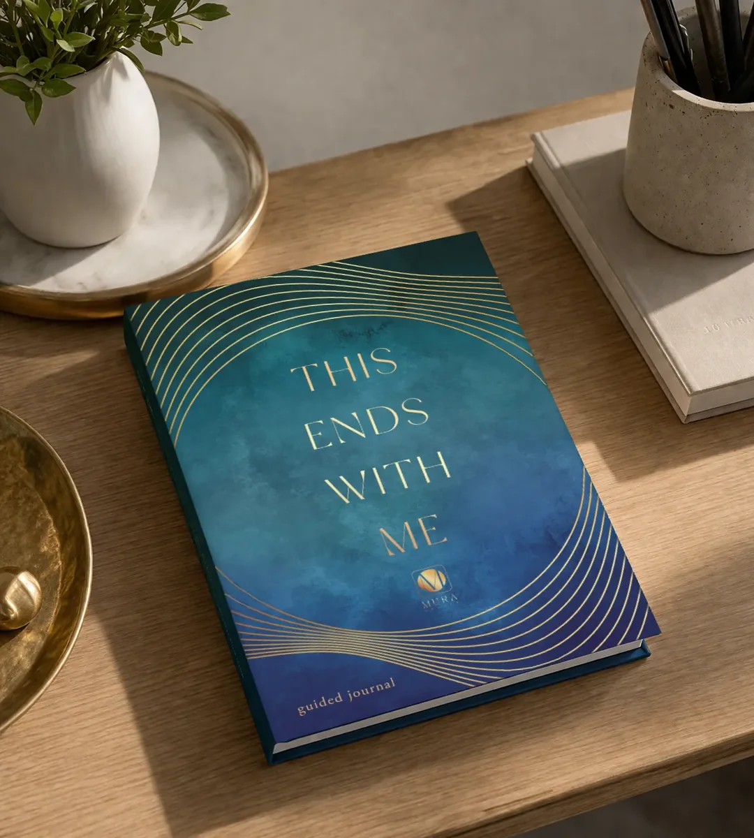
I designed the identity in a brand sprint: the logo suite, palette and type system. Then I carried it into a proposed website and the Mura Journal cover.
[1] The Mura Circle Quiz[2] The Listening Circle podcast[3] Mura Journal
Mura and Circle together in a single icon that works from an app icon to a book cover.
Deep teal, gold and fine detail, so the brand reads premium at first glance.
The same look across a proposed website, the quiz and a journal cover.
A rounded square with one fine outline gives the mark the shape of an app icon and a seal, at home on a phone screen or a book cover.
At its heart sits a circle: the Circle in Mura Circle, filled with the brand’s gold gradient.
The M isn’t drawn at all. It’s the space cut through the circle, so the letter and the shape read as one.
In gold on deep teal it leads the primary logo, sits above the MURA wordmark, and stands alone as the icon.
A logo suite for light and dark surfaces, a palette led by deep teal and gold gradients, and a three-family type system.


Thin, high-contrast capitals for the wordmark and page titles.
An elegant second voice for taglines and H2s.
Return to your rhythm.
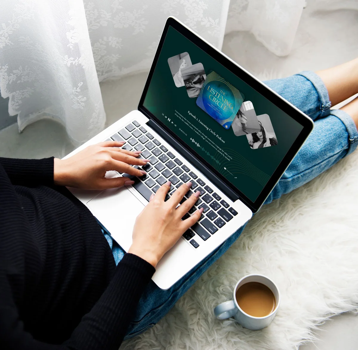
The identity out in the world: the podcast, the guided journal and the quiz app.
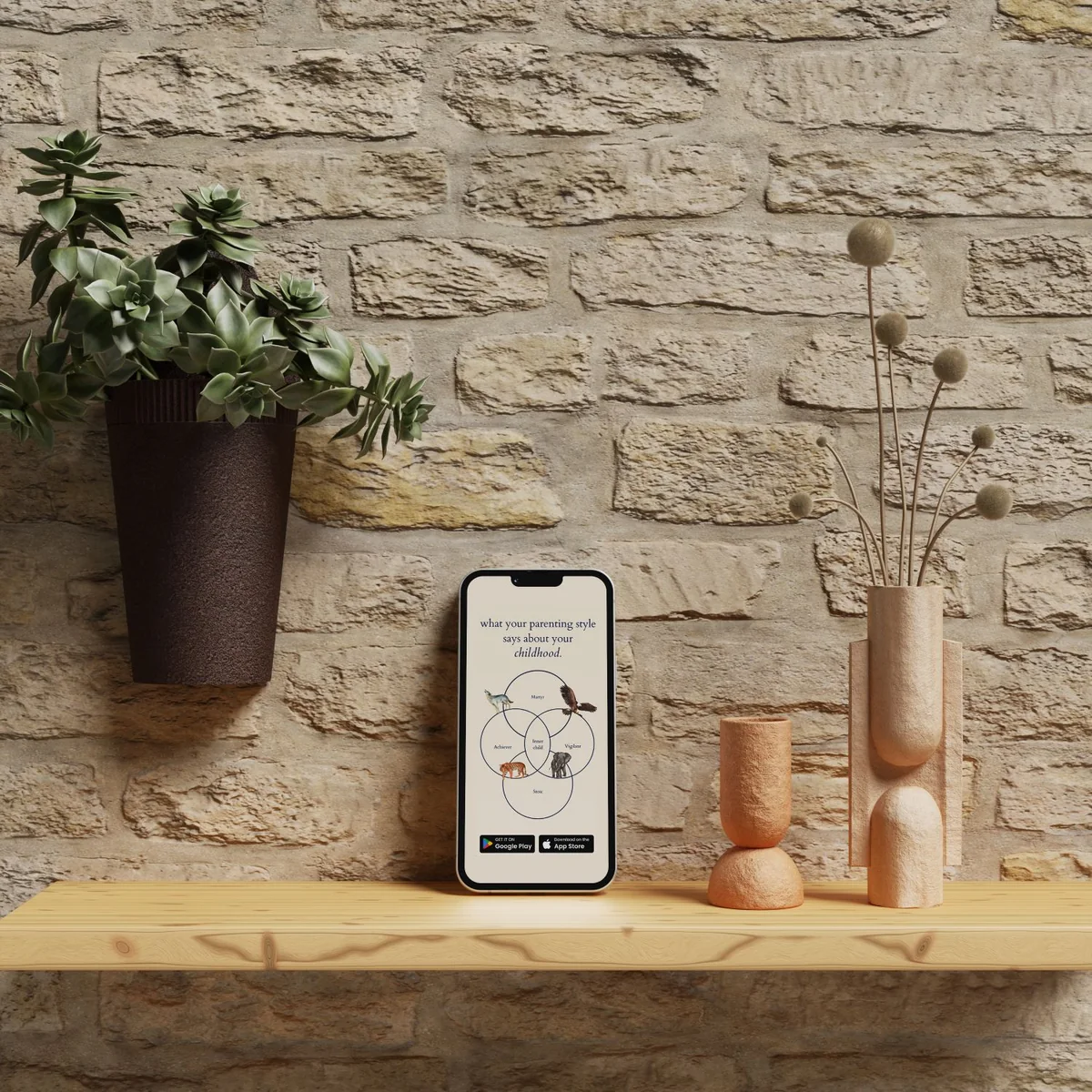
The homepage in a light and a dark direction, and the quiz pop-up that leads into it. Hover a page to scroll it.


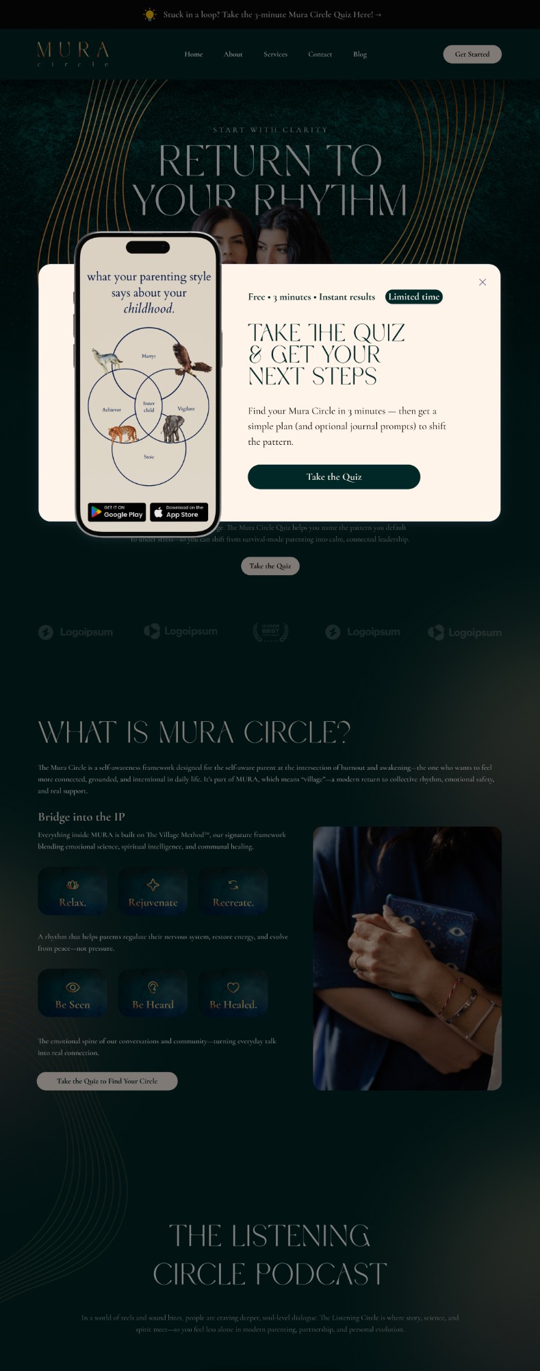
Proposed UI. Some sections still carry placeholder copy and logos.
Since the brand went live, people are registering for the waiting list of the upcoming Mura Circle app. The Mura Circle logo now leads muracircle.com and the guided journal; the dark website UI shown here was delivered as a proposal.